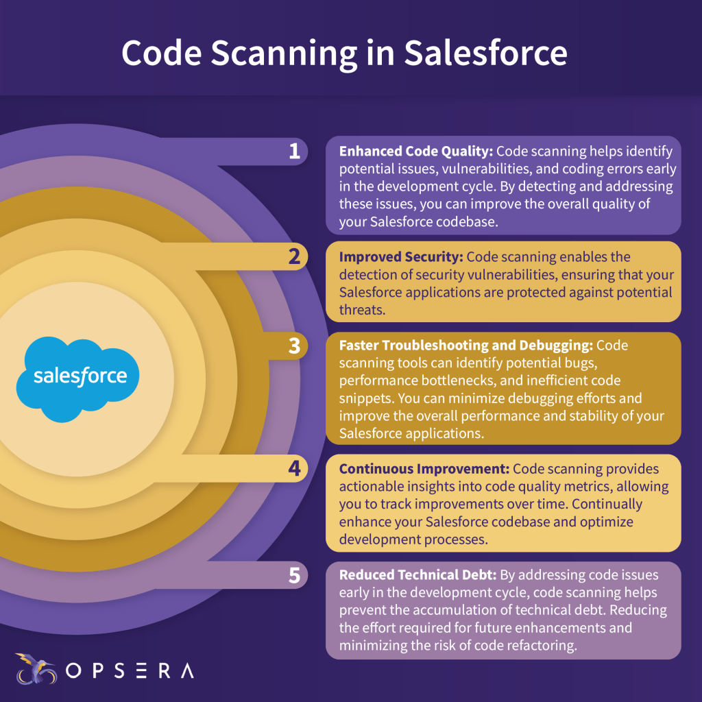
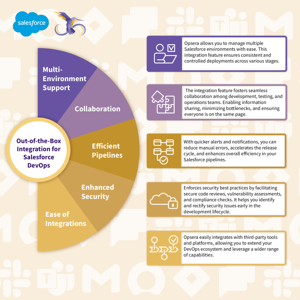
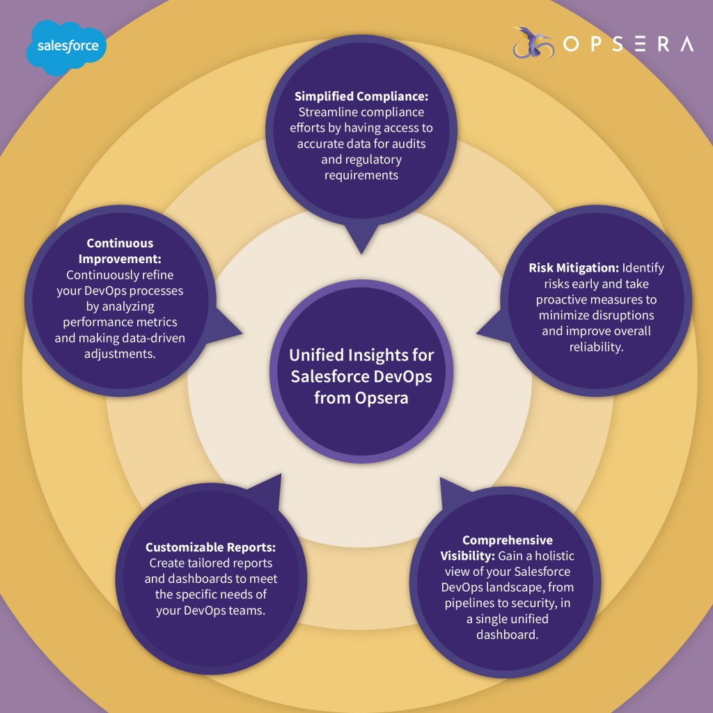
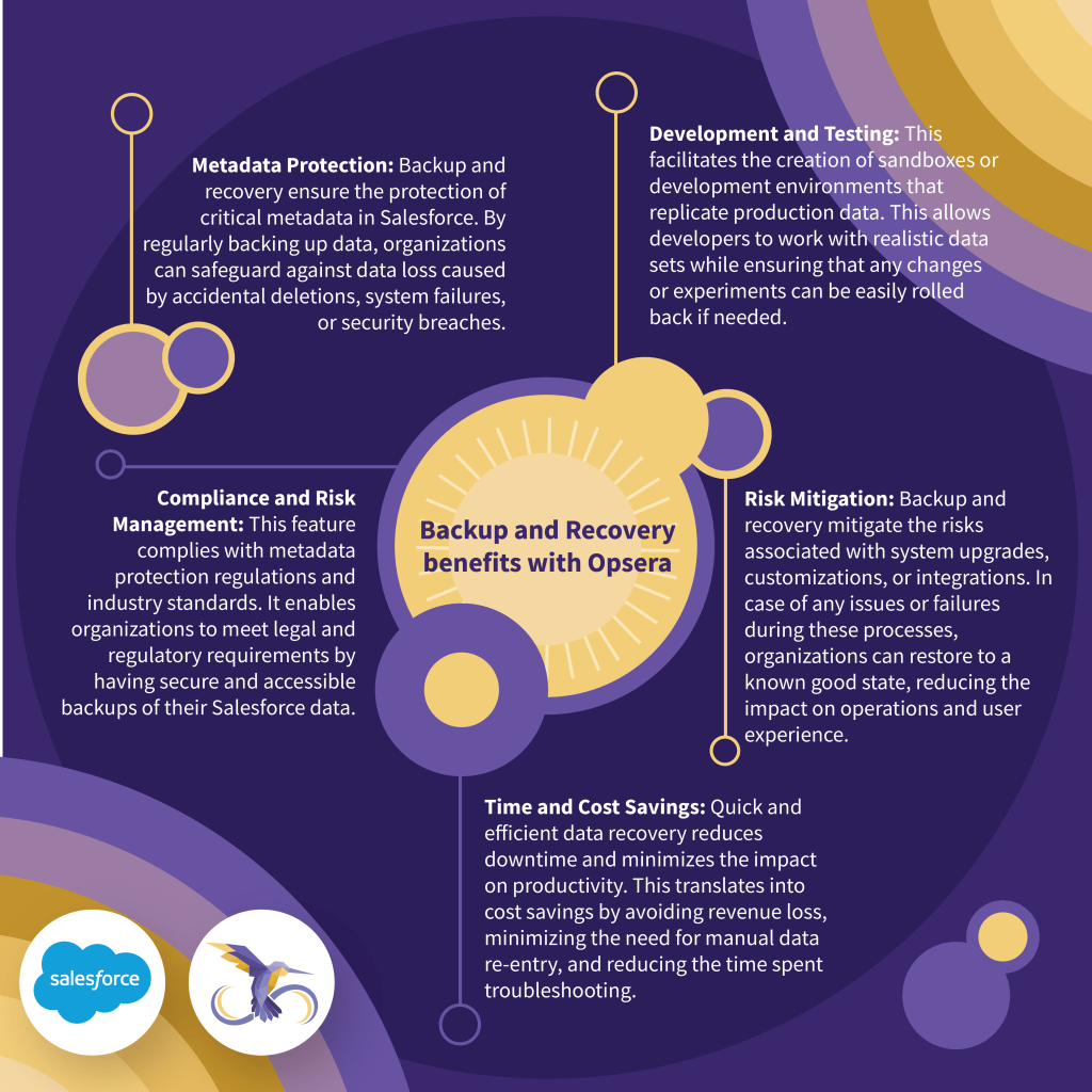
The series focused on simplifying topics—everything from step-by-step guides to detailed feature explanations. Our goal was to make Opsera’s unique offerings easy to understand and visually engaging for their social media followers. By breaking down complex processes into digestible visuals, we created a resource that not only informed but also caught people’s attention as they scrolled.
A rewarding aspect of this project was seeing the infographics resonate with Opsera’s audience. The series gained significant traction on social media, with followers appreciating the simplified approach to understanding powerful DevOps tools. The positive responses were a great testament to the fact that, when data is presented in a visually appealing way, it truly engages and educates.
Packaging technical information into a clean, aesthetic format can be a challenge, but it’s one I enjoy tackling. It was fulfilling to see how thoughtful design could transform dense content into something approachable and impactful. This project was not only about creating visuals but about crafting a narrative that guided viewers through each feature and integration, making complex information easy to digest.
Whether for Opsera or any other brand, I believe in the power of visuals to make information accessible. With this series, we turned data into a story—one that connected with users and supported Opsera’s mission to make DevOps workflows seamless and intuitive.

Leave a comment